
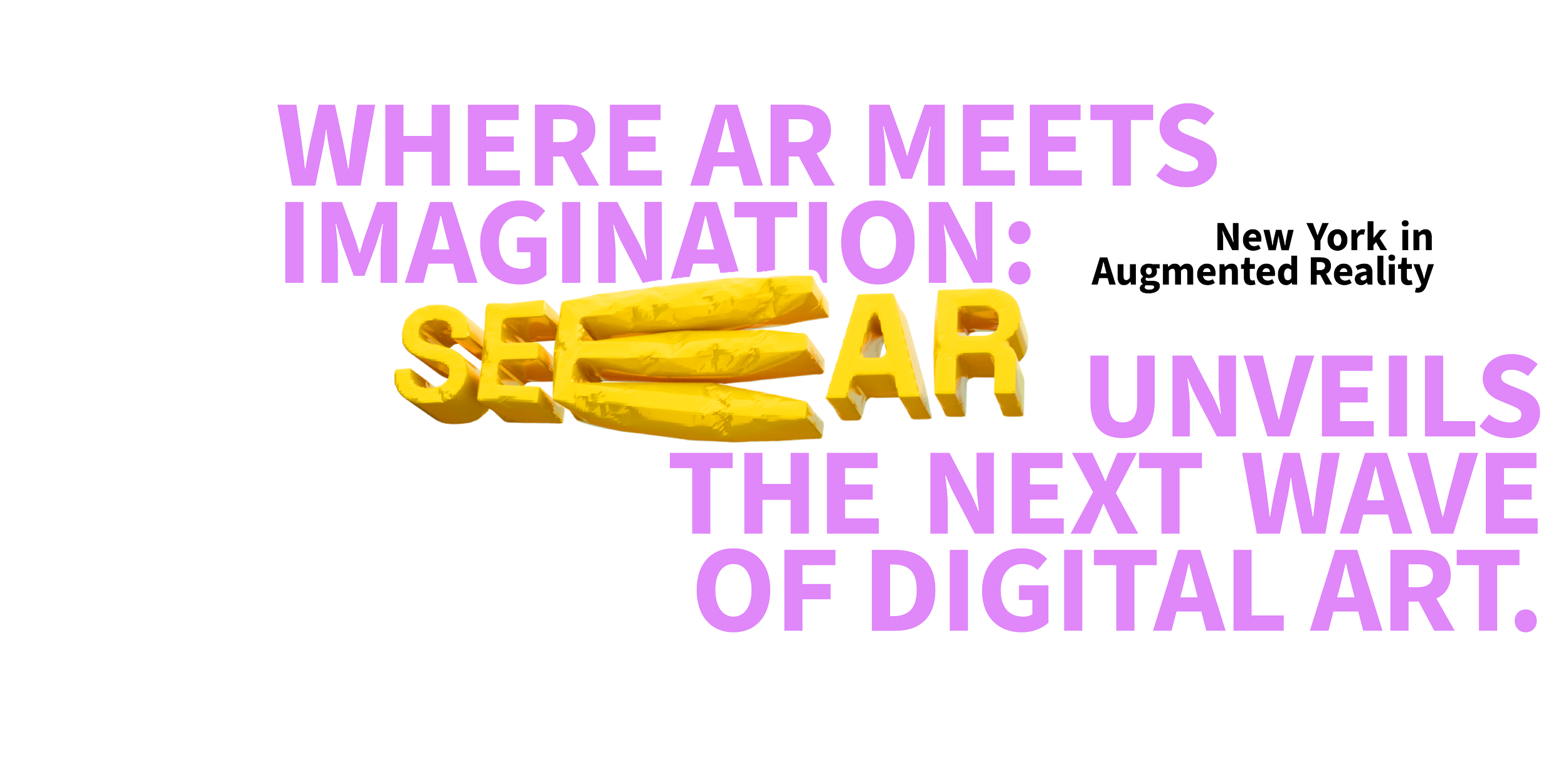
SeeAR is an online festival that brings AR artists in New York together to showcase interactive AR works. During the event, artists will present their latest AR creations inspired by the city.
We believe digital art shouldn’t stay still - and neither should you. SEE AR reimagines urban space as a playground for participation, curiosity, and shared imagination.
It’s not just AR. It’s “Whoa, did you see that?” energy.
About SeeAR
Responsibility
Brand Identity
Visual Design
2D/3D Motion
Web
Credits
Personal Project


The Industry
• AR Design, Software Development, Art, Interaction Design • Tourism, Product Design, Data IT Industry
Trends
• The trend is the development of technology to interact with life. • AR products and AR software such as Meta/Google/Apple AR glasses and Meta Spark AR
Adjacent Sector
• Like an interactive art exhibit • A digital art map
Industry
Customer
• AR designers
• AR software developers • AR lovers
• Citizen or travelers
Brand Voice
• Belonging, welcoming
Brand Personality
• Warm, celebrate, energetic
• fun, interactive, colorful
Design Goal

The sans-serif font gives the brand a modern look. From the start, the logo was designed with motion, making it easy to use on both the website and app.
In the motion design, "Seeing" represents searching and gazing, capturing a sense of curiosity. The stretched font adds a playful touch and make the experience more dynamic and attractive.
Logo


Regarding color selection, I wanted SeeAR's website and branding to have a relaxed, entertaining, happy and colorful vibe. So I chose different colors from the rainbow and ended up with yellow, red and purple. These three colors also represent different times of the day, afternoon and night. Through this, I want to express that at different times of the day and night, users can find AR works perfect for their time.
Brand Color